Mauricio Rodríguez

Work / iVisa, 2022 to 2026

Conversion and experimentation at iVisa

Introducing the right friction at the right moments, for people applying for visas and travel documents under time pressure.

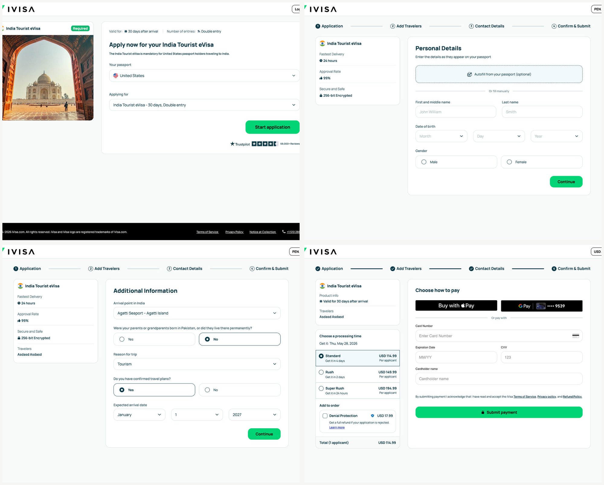
iVisa application flow: product selection, personal details, additional information and payment
Role
Design Director (Global)
Scope
Pre-payment funnels, eligibility, checkout, document upload, post-payment
Worked with
Product, Growth, Engineering, Operations, CX
Team
Built and led a team of 8 designers
30%8%

support contacts

45%10%

document upload friction

2%4%

conversion on key flows

Measured across our most complex, highest-volume products.

The short version30 seconds

The problem
Early experiments removed steps before payment. Conversion went up in the short term, but refunds and support contacts grew later in the journey. People were buying products they weren't eligible for.
What I did
Led UX strategy and experimentation across the funnel, and reframed friction as protection: eligibility before payment, clear expectations, reassurance in the anxious moments. Then built the systems so several teams could test on the same surfaces at once.
What changed
Fewer people needed support, uploading documents stopped being the scary step, and conversion on key flows went from about 2% to 4%.

Key moments

Five moments, about 3 minutes

1 of 5

A faster checkout backfired

Our first bet was the obvious one: fewer steps and fields before payment, faster checkout, more conversion. Short-term conversion did lift.

But refunds and support contacts grew downstream, because people were buying products they weren't eligible for. The problem stopped being UI and became operational.

What support kept hearing

  • "I already paid and now I don't understand what happened."
  • "Why wasn't this explained earlier?"
  • "I paid for something that wasn't applicable to me."

2 of 5

Friction wasn't the enemy

The best-performing experiences were not always the ones with the least friction. They were the ones users trusted the most.

We stopped treating every step as a tax and started asking which moments earned trust, set expectations or prevented costly mistakes later.

Anti-pattern

No friction

  • Faster start
  • Wrong purchases
  • Refunds
  • Support burden
  • Loss of trust

Over-correction

Too much friction

  • Users abandon early
  • Feels complex
  • Lower conversion

What we aimed for

Smart friction

  • Questions at the right moment
  • Users know why we ask
  • Eligible users continue smoothly
  • Ineligible users avoid paying for the wrong product

3 of 5

The AI Experimentation Lab: six ways to ask

The question became where to ask about eligibility without scaring off people who qualify. Using AI-assisted prototyping, we explored 18+ variations in parallel across six concepts and three products (India eVisa, UK ETA, Canada ETA), and compared them on clarity, conversion risk and effort before anything went to engineering.

Asking at a natural transition, or splitting broad checks from per-applicant questions, came out ahead. Asking on the first screen protected the most, but cost the most conversion.

Explore the Lab: every concept across three products, the research behind it, and three live prototypes you can click through.

ConceptClarityConversion riskEffortVerdict
A. Upfront eligibilityHighMed to highLowSafety net
B. Inline earlyMediumMediumLowTactical
C. Smart checkpointHighLow to medMediumRecommended
D. Progressive qualificationMediumLow to medHighLong term
E. Two-phase hybridHighLowMediumRecommended
F. Final checksLowMediumLowSafety net only

4 of 5

Making the document upload less scary

Uploading a passport is where anxiety peaks: sensitive data, little margin for error, and a deadline. We set expectations before the upload, auto-filled from the passport, rewrote errors so people knew how to fix them, and generated the visa photo from the same upload.

Upload friction went from 45% to 10%.

Sets expectations up front
Auto-fills from the passport
Errors people can fix
Photo from the same upload

5 of 5

Scaling it across teams

With several teams launching experiments on the same surfaces at the same time, no single test mattered as much as the system around them.

I built component systems, experimentation governance and AI-assisted prototyping workflows, so teams could iterate fast without losing consistency or trust.

2%4%

conversion on key flows, measured across our most complex, highest-volume products

What I'd bring to the next team

Speed alone is not a strategy.

Frictionless checkouts created downstream refunds and support load. Optimizing for understanding beat optimizing for speed.

Eligibility belongs before commitment.

Helping users self-select protected revenue, reduced operational cost and built long-term trust.

Build systems, not isolated experiments.

With multiple teams running variants in production, scalable systems and governance mattered more than any single test.

AI Experiment Lab Interactive

AI Experimentation Lab

Reducing refund risk through smart eligibility design

Users were discovering they were ineligible after payment, creating refunds, support burden and poor customer experiences.

The design challenge: introduce smart friction by catching ineligible users early without discouraging eligible ones. We tested different eligibility placements, screening scopes (general and applicant questions vs. applicant-only) and product conditions across multiple visa products.

Three representative prototypes are live to explore. The other concepts show the broader exploration set.

Swipe sideways to see the UK and Canada columns.

India Tourist eVisa
UK ETA
Canada ETA
AUpfront eligibility

Screen before anything.

General + applicantHigh confidence
A · UKConcept only
A · CanadaConcept only
BInline early

Ask alongside personal details.

Applicant only
B · UKConcept only
B · CanadaConcept only
CSmart checkpoint

Ask during a natural transition.

General + applicantLow risk
C · UKConcept only
C · CanadaConcept only
DProgressive qualification

Make eligibility visible as users move through the flow.

Applicant onlyHigh confidence
D · IndiaConcept only
D · UKConcept only
D · CanadaConcept only
ETwo-phase hybrid

Separate broad checks from specific applicant questions.

General + applicantLow risk
E · IndiaConcept only
E · UKConcept only
E · CanadaConcept only
FFinal checks

Catch issues before payment.

Can't applyDon't need this
F · IndiaConcept only
F · UKConcept only
F · CanadaConcept only

Where eligibility is asked, across product page, applicant form, review and payment.

India Tourist eVisa

Hypothesis

Why it matters

The full process

Everything behind the story, for the people who want all of it. Open what you need.

Context1 min

During my time at iVisa, I led and contributed to experimentation, conversion optimization and trust-building initiatives across global travel products. The work spanned pre-payment funnels, eligibility systems, checkout experiences, document upload journeys and post-payment experiences across multiple countries and products.

Unlike traditional CRO environments, these journeys carried unusually high emotional and operational complexity: users applying under time pressure, navigating unfamiliar government requirements, uploading sensitive information, and often making decisions with little room for error. Increasing conversion wasn't simply about reducing friction. It was about introducing the right friction at the right moments.

Who we were designing forChallenges and anxieties
  • Users were often applying under time pressure with upcoming flights or visa deadlines.
  • Confusion around evolving government requirements created fear of irreversible mistakes.
  • Sensitive personal documents had to be uploaded with very little margin for error.
  • Eligibility rules were unclear and varied across countries and products.
  • Many users assumed they were interacting directly with a government service.

User anxiety signals

  • Fear of paying for the wrong product
  • Uncertainty around government requirements
  • Low confidence in uploaded information
  • Anxiety around timing and deadlines
  • Fear of irreversible mistakes

Design implications

  • Help users see if the product fits their situation
  • Set expectations before commitment
  • Reduce costly downstream mistakes
  • Balance speed with confidence
  • Prioritize trust over short-term completion gains
Constraints4
  • Multiple teams launching experiments simultaneously across the same surfaces.
  • Operational and government requirements changing constantly across markets.
  • Heavy interdependence between Product, Growth, Engineering, Operations and Support.
  • Constant tension between speed, clarity, trust, operational feasibility and revenue.
How the work unfolded4 phases

Hypothesis

Optimize for speed. Early experiments reduced steps and fields before payment, assuming faster checkout meant higher conversion. Short-term conversion sometimes improved.

Discovery

See the downstream cost. Removing friction increased refunds, support contacts and abandonment later in the journey. Users were buying products they weren't eligible for.

Reframe

Reframe "Prevent submission". The challenge became smart friction: catching ineligible users early without discouraging eligible ones.

Scale

Scale via systems. Component systems, experimentation governance and AI-assisted prototyping so multiple teams could iterate quickly without losing consistency or trust.

Experiment log3 tests
TestHypothesisResult
Reduced-steps checkoutRemoving eligibility friction before payment will increase conversion.Short-term conversion lifted, but refunds and support contacts grew significantly downstream.
Eligibility gating before paymentAsking the right qualifying questions up front reduces refunds without killing conversion.Lower refund signal and stronger user understanding, with an acceptable conversion trade-off.
Reassurance and expectation messagingContextual explanations and timeline transparency reduce abandonment in high-anxiety moments.Better completion in document upload and post-payment; less support dependency.
Journey surfaces covered7

Custom landing pages, pre-payment funnels, eligibility systems, checkout, document upload, post-payment experiences, customer support flows.

What I led and who I partnered with

I led

  • UX strategy and experimentation across growth, onboarding and post-payment.
  • Design processes, collaboration systems and experimentation workflows for the team.
  • Design system consistency, file organization and governance as experiment velocity grew.
  • Coaching the team on behavioral UX analysis, rapid prototyping and AI-assisted workflows.

I partnered with

  • Product on funnel strategy, eligibility logic and onboarding direction.
  • Growth on acquisition flows, landing page experiments and demand signals.
  • Engineering on experimentation infrastructure and component scalability.
  • Operations and Support on the downstream impact of every UX decision.

Some visuals and implementation details have been simplified or anonymized to respect confidentiality.