Mauricio Rodríguez

Work / iVisa, 2025 to 2026

B1/B2 Visa: Designing for anxiety, complexity, and trust

Research, UX strategy and product direction for a Spanish-speaking B1/B2 visa experience, one of the most emotionally stressful digital journeys people ever go through.

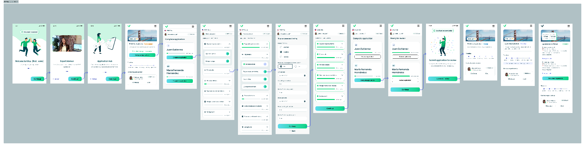
The redesigned B1/B2 journey, screen by screen
Role
Design Director (Global). Research, UX strategy, product direction
Stage
Research to launch, live for a controlled audience in select countries
Research
80+ interviews: 10 in-depth 1:1s in Mexico, Peru and Colombia, about 70 in the field in Bogotá
Worked with
Research, Product, Growth, Operations, CX

Result

~60%~12%

refund rate, first two months live

Along the way

~4.9%

ad to landing click-through

~27.9%

landing to CTA click-through

Measured over a bit more than two months, with a controlled audience in select countries.

The short version30 seconds

The problem
The B1/B2 product was sold like any other eVisa we offered. People paid with no idea what to expect, and asked for a refund a couple of days later. Nearly 60% of them. Meanwhile, the U.S. government issued about 6.5M B1/B2 visas worldwide in 2024. That was the size of the market we wanted to serve.
What I did
Led it end to end. Validated demand with smoke tests before redesigning anything, ran in-depth 1:1 interviews with applicants in Mexico, Peru and Colombia, and about 70 field interviews outside the U.S. Embassy in Bogotá. Then reframed the product from a form to fill as fast as possible into a guided copilot, built the prototypes, led my team through the designs, and took it live for a controlled audience.
What changed
It finally behaved like a proper product of its own. In its first two months live, refunds dropped from about 60% to about 12%.

Key moments

Six moments, about 3 minutes

1 of 6

A product with a 60% refund rate

B1/B2 was one of iVisa's worst-performing products. It was treated like a regular eVisa, but an embassy visa means interviews, appointments and months of waiting. People didn't know what they were buying.

Most existing services, ours included, focused on paperwork instead of reassurance.

Before: the legacy B1/B2 experience.

2 of 6

Test demand before redesigning

Instead of starting with a redesign, we launched smoke-test landing pages in Spanish-speaking, B1/B2-required markets, positioned around approval confidence, human support and interview prep. It was cheaper than a redesign and gave real signal on trust drivers, pricing and willingness to pay.

About 4.9% click-through from ads, 27.9% from landing to CTA, and CAC below target.

Full mobile smoke-test landing page
Smoke-test landing pages. Scroll the phone to see the full page.

3 of 6

Outside the embassy in Bogotá

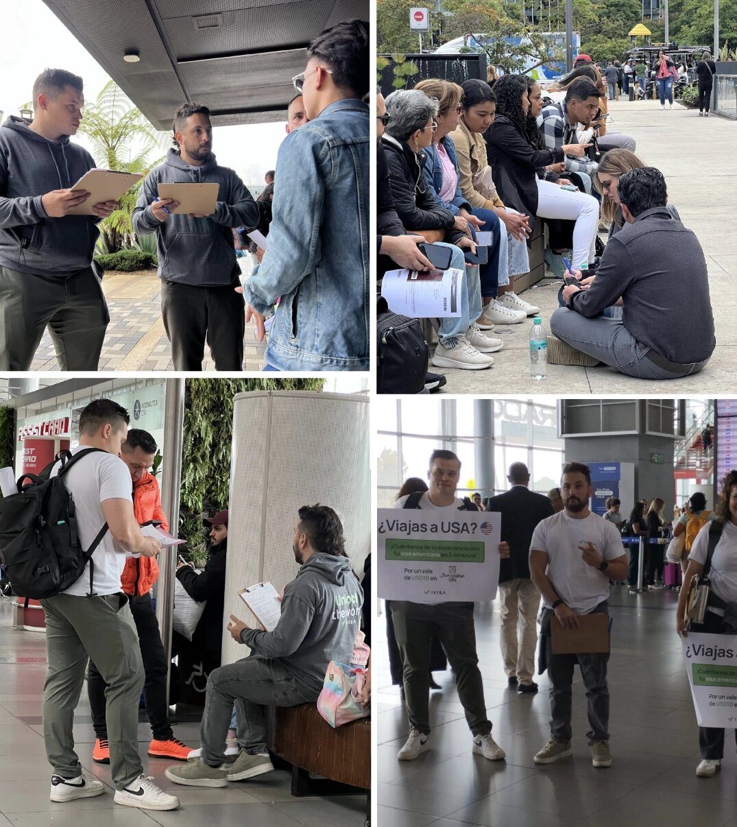
We went to where the applicants were: outside the U.S. Embassy and biometric centers in Bogotá. About 70 guerrilla interviews (around 25 of them mine, the rest by the team), plus observation, conversations with families, and watching how agencies and competitors worked.

Together with 10 in-depth 1:1 sessions of about 90 minutes each with applicants in Mexico, Peru and Colombia, it changed the problem from usability to emotional reassurance.

Users were willing to power through complexity, language barriers, and endless forms because this document represented something much bigger than travel.
Interviews with applicants at the airport, the U.S. Embassy and biometric centers in Bogotá
Bogotá field research: airport, U.S. Embassy and biometric centers.

4 of 6

From a form to a guided copilot

We shifted the goal from "collect information as quickly as possible" to "help people feel supported and confident". Conversational UX, warm language, contextual explanations on the hard questions, visible timelines, and human touchpoints: account managers, interview coaching, pre-submission reviews and WhatsApp, which we'd seen people rely on in the field.

Open the Figma prototypeThe clickable prototype used in research with applicants and in stakeholder reviews. Opens in Figma.

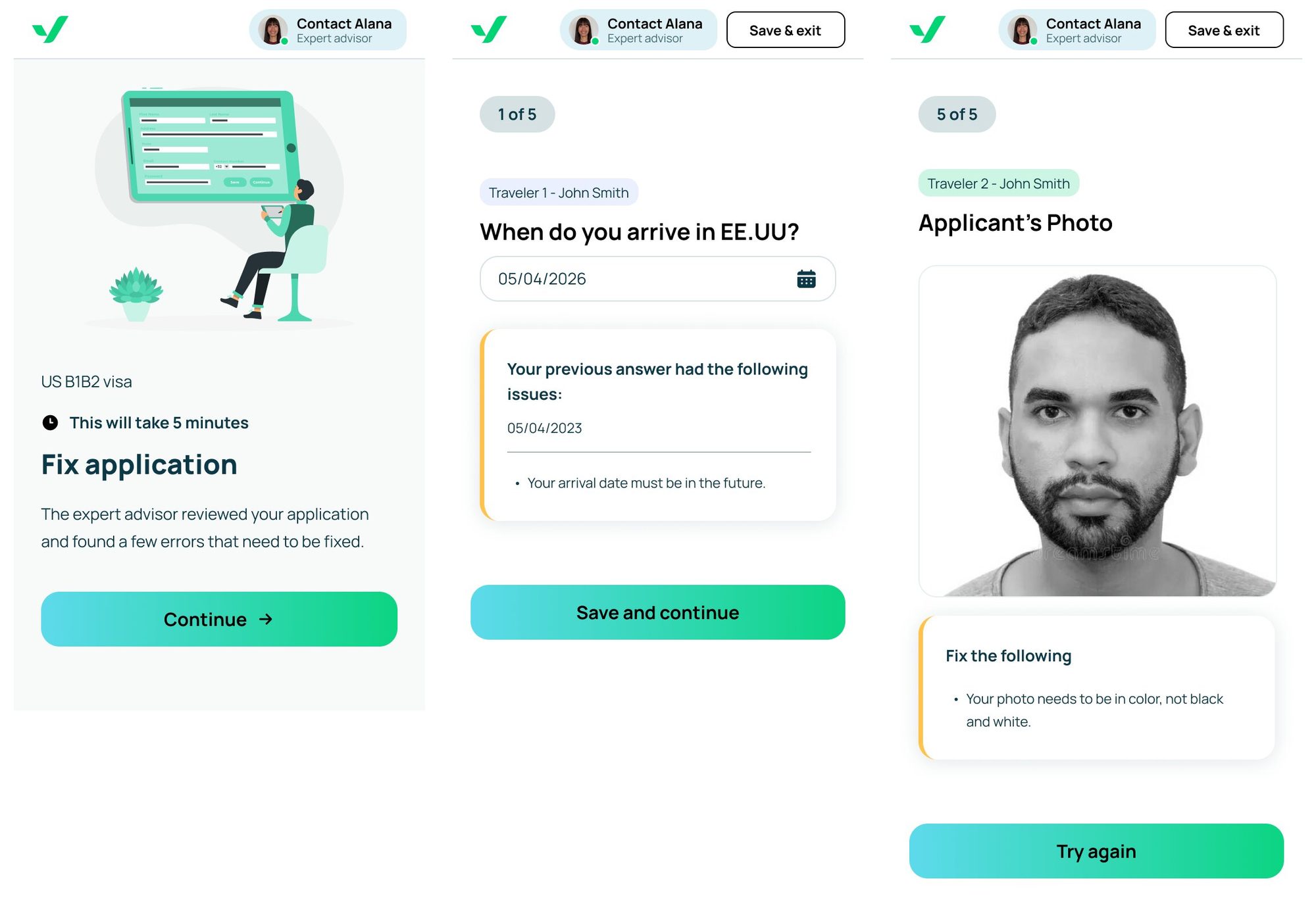
Guided application review: fix application, arrival date and applicant photo screens

5 of 6

Making the case to leadership

I framed the strategic story around trust, reassurance and conversion. With the U.S. issuing about 6.5M B1/B2 visas in 2024 and weak competitors, embassy visas deserved to be a strategic vertical, which opened a broader product roadmap.

Presenting the B1/B2 research findings and strategy to leadership.

6 of 6

Live for a controlled audience

B1/B2 went live for a controlled audience in select countries. Expectation-setting before payment, the new landing pages and the copilot flow all shipped together, and for the first time it behaved like a proper product of its own. In a bit over two months, refunds fell from about 60% to about 12%.

~60%~12%

refund rate, first two months live, select countries

What I'd bring to the next team

Reduce uncertainty before reducing fields.

Field research showed users would tolerate complexity if they felt safe. The real challenge wasn't helping them complete forms, it was helping them feel safe enough to move forward.

Validate demand before redesigning.

Smoke tests were cheaper than a redesign and gave real signal on trust drivers, pricing and willingness to pay for human support.

Trust often begins outside the product.

Real-world research uncovered behaviors that analytics alone would never reveal.

The full process

Everything behind the story, for the people who want all of it. Open what you need.

Context1 min

iVisa's B1/B2 visa product was one of the company's worst-performing offerings, with nearly a 60% refund rate before the redesign. At the same time, embassy visas represented a massive strategic opportunity: in 2024 alone, the U.S. issued about 6.5M B1/B2 visas worldwide. Instead of treating the problem like a traditional form optimization exercise, we reframed it as a human-centered guidance experience designed around fear, reassurance and confidence.

Who we were designing forFears and meaning

What they feared

  • Losing their chance at getting approved
  • Making irreversible mistakes
  • Missing important life opportunities
  • Getting rejected by the U.S. government
  • Wasting months of preparation and money

What it represented

  • Family reunions
  • Travel dreams
  • Migration aspirations
  • Access to a better future
The challengeMarket and product
  • The U.S. issued about 6.5M B1/B2 visas worldwide in 2024, one of the largest embassy visa segments in the world.
  • Existing online competitors were fragmented and inconsistent.
  • The experience was operationally complex and emotionally difficult.
  • Most existing services focused on paperwork instead of emotional reassurance.
  • The previous iVisa B1/B2 experience was underperforming with extremely high refund rates (~60%).
Constraints4
  • Live product with high refund rates: every change had to protect existing revenue.
  • Spanish-speaking, B1/B2-required markets with low digital trust and heavy reliance on informal agents.
  • U.S. consular requirements were fixed, so only the surrounding experience could change.
  • Cross-functional alignment required across Product, Growth, Operations and CX.
How the work unfolded5 phases

Pre-discovery

Validate demand with smoke tests. Landing pages for Spanish-speaking and B1/B2-required countries (Jamaica, others), positioned around approval confidence, human support and interview prep.

Discovery

Interviews and field research. 10 in-depth 1:1 sessions with applicants in Mexico, Peru and Colombia, then about 70 guerrilla interviews outside the U.S. Embassy and biometric centers in Bogotá, plus observation of families, agencies and competitors.

Strategy

Reframe the problem. From "collect information as quickly as possible" to "help users feel supported and confident throughout the journey". The funnel became a guided copilot.

Prototyping

Prototype and validate. Guided onboarding, conversational UX, interview prep, account manager support and pre-submission reviews, tested with real applicants.

Launch

Controlled launch. Live for select countries. Refunds fell from about 60% to about 12% in a bit over two months.

Approach3 moves
  • A guided copilot, not a form. Conversational UX, expectation-setting and progress visibility replaced cold government-style forms.
  • Reassurance-first onboarding. Warm language, contextual explanations around difficult questions, visibility into timelines and stages.
  • Human support touchpoints. Key account manager support, interview coaching, pre-submission reviews, appointment scheduling help and multi-channel experiences including WhatsApp.

Proposed journey: reassurance and expectation-setting, guided onboarding, contextual application form, pre-submission review, interview prep and coaching, appointment and multi-channel support.

Experiment log4 tests
TestHypothesisResult
Smoke-test landing pagesTrust-led positioning drives stronger demand than paperwork-led positioning.~4.9% CTR from ads to landing page.
Support-oriented CTAFraming the offer around reassurance and human guidance increases CTA engagement.~27.9% CTR from landing page to CTA.
Pricing and CAC validationA premium, support-oriented embassy visa product can sustain healthy CAC in target markets.Lower CAC signals than initially anticipated.
Controlled launchTreating B1/B2 as its own product, with expectations set before payment and guided support, will cut refunds.Refunds fell from ~60% to ~12% in a bit over two months, with a controlled audience in select countries.
What I led and who I partnered with

I led

  • UX strategy and research direction across a cross-functional embassy visa initiative.
  • 10 in-depth 1:1 interviews (about 90 minutes each) with applicants in Mexico, Peru and Colombia, and about 25 of the ~70 field interviews in Bogotá.
  • Prototypes for research and validation, built hands-on.
  • The design team through the redesign, from guided onboarding to the pre-submission review.
  • Service design, journey mapping and behavioral and emotional research synthesis.
  • The strategic narrative around trust, reassurance and conversion for senior stakeholders.
  • Funnel and onboarding direction; coached the team through early prototyping.

I partnered with

  • Product on funnel strategy and onboarding exploration.
  • Growth on smoke-test landing pages, ad creative and demand signals.
  • Operations and Customer Support on real-world process complexity.
  • Product and Growth leadership to define the broader embassy visa opportunity.
More reflections
  • High-stakes experiences require emotional design, not just usability improvements.
  • Users will tolerate complexity when emotional motivation is high.

Some visuals and implementation details have been simplified or anonymized to respect confidentiality.