Mauricio Rodríguez

Work / B89, 2019 to 2021

B89: Digital financial inclusion in Peru

Peru's first credit card you could get entirely through an app: credit check and approval in about 10 minutes, then the card delivered to your door. Designed for people who didn't trust online banking yet.

Every designer probably has one project they keep closest to the chest. The one where they had real ownership, shaped important decisions, and watched it grow from the beginning. For me, this was that project.
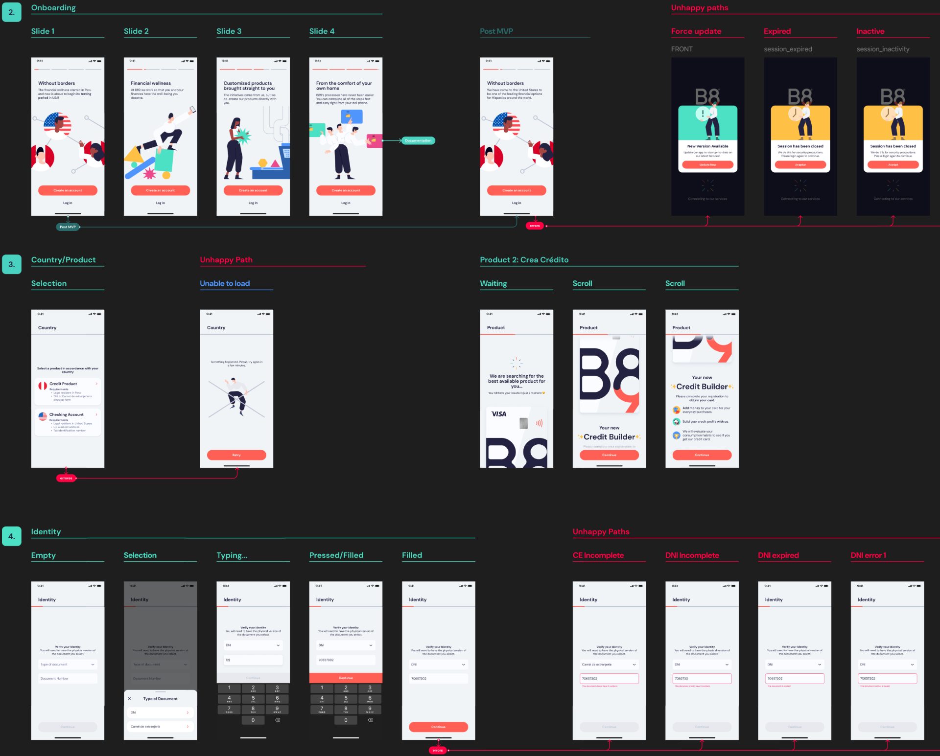
B89 app flows: onboarding, product selection and identity verification
Role
UX Director, early core team, first designer
Timeline
Nov 2019 to Dec 2021. Joined four months before Peru's lockdown
Scope
Product feel, onboarding, core flows, visual direction, rewards
Worked with
Founders, Product, Engineering
1st

credit card in Peru you could get entirely through an app

10 min

to check your credit history and approve the card, in the app

No other financial service in Peru could review your credit history and approve a credit card from an app at the time. Then we delivered the card to your home.

The short version30 seconds

The problem
Much of Peru's economy was informal, many people distrusted online payments entirely, and banks felt cold, bureaucratic and intimidating. For a lot of users this would be their first digital financial product.
What I did
As the first designer on the early core team, I shaped how B89 should feel, the onboarding strategy, the visual direction and the UX vision, and pushed beyond the interface into tone, naming, rewards and feature priorities. I grew the design team to five.
What came out of it
Peru's first credit card you could get entirely through an app, approved in about 10 minutes and delivered home, from a fintech that felt like a lifestyle product for younger Peruvians, not a bank.

Key moments

Four moments, about 2 minutes

1 of 4

Trust was the real design problem

Low digital trust, fear of fraud, limited financial literacy and first-time digital banking behavior. We treated trust as the primary design problem, not a compliance one. Onboarding, copy, motion and visual design all worked together to make digital finance feel emotionally safe.

Trust is often emotional before it becomes rational.

2 of 4

A lifestyle product, not a bank

With the founders and product, we defined B89 as younger, friendlier and less corporate than traditional banks. The goal wasn't another finance app. It was making digital banking feel accessible, aspirational, simple and emotionally engaging.

The card launch: "for people who have never had a credit product".

3 of 4

A credit card in 10 minutes, from an app

At the time, no other financial service in Peru could review your credit history and approve a credit card from an app. B89 did it in about 10 minutes: digital registration, in-app qualification, approval, and then we sent the card to your home.

Every step was designed to reduce intimidation for people adopting these products for the first time, and validated fast with guerrilla research and behavioral observation.

People do not adopt new financial habits because technology exists. They adopt them when the experience feels useful enough to fit into their lives.
The complete B89 onboarding flow, screen by screen
The fully digital onboarding flow. Scroll sideways to follow it.

4 of 4

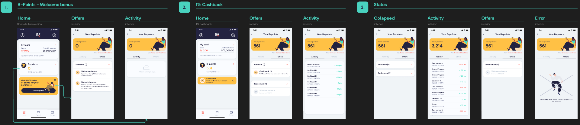
B-Points: rewards you could actually use

Instead of generic cashback, users could apply earned points to specific purchases and effectively erase them from their statement. That sense of control made rewards feel immediate and meaningful, and set B89 apart from traditional banks.

B-Points flows, states and edge cases
B-Points: flows, states and edge cases.

Afterwards

Talking about it with Onfido

During B89's development, Onfido invited me to discuss digital onboarding, financial inclusion and the role of customer experience in building trust in digital banking.

What I'd bring to the next team

Treat trust as a design problem.

In a low-trust environment, emotional safety drove adoption more than feature completeness.

Identity drives adoption.

Positioning B89 as a lifestyle product, not a banking platform, made it feel modern and aspirational without losing credibility.

Momentum over perfect process.

Inside an early-stage startup, clarity, speed and adaptability mattered more than heavy methodology.

The full process

Everything behind the story, for the people who want all of it. Open what you need.

Context1 min

Before the pandemic accelerated digital adoption across Latin America, Peru still faced significant barriers around financial inclusion and trust in digital banking. A large portion of the economy operated informally, many users distrusted online payments entirely, and digital financial products still felt intimidating or inaccessible to a large percentage of the population.

B89 was created during that transition. As part of the early core team and the company's first designer, I shaped the product experience, onboarding strategy, visual direction and overall UX vision for a new fintech platform focused on making digital financial services feel more approachable, modern and trustworthy for younger Peruvian audiences.

The challenge5
  • Low digital trust and widespread fear of online payments and credit card fraud.
  • Financial anxiety and limited financial literacy in key audience segments.
  • First-time digital banking behavior: users adopting these products for the first time.
  • Traditional banking experiences felt cold, bureaucratic, intimidating and visually outdated.
  • Rapid product iteration inside an early-stage startup environment.
Constraints4
  • Limited resources and shifting priorities typical of early-stage startups.
  • Fast-moving timelines requiring lightweight validation over heavy process.
  • Designing for a market with low baseline trust in digital financial systems.
  • Balancing regulatory and operational realities with an aspirational product feel.
How the work unfolded4 phases

Phase 1

Define the product feel. With founders and product: younger, friendlier, more lifestyle-oriented and less corporate than traditional banks.

Phase 2

Onboarding and core flows. Mobile onboarding, eligibility and core app flows aimed at making first-time digital banking feel emotionally safe.

Phase 3

Rapid iteration. Guerrilla research, behavioral observation and fast prototyping inside a fast-moving startup.

Phase 4

Differentiated features. Expense tracking, B-Points rewards, bill splitting and simplified spending visibility, still uncommon locally at the time.

Journey: digital registration, in-app qualification, eligibility and onboarding, card delivered to home, first-use experience, rewards (B-Points) and engagement.

Experiment log2 bets
BetHypothesisResult
Fully digital onboardingUsers will adopt a fully digital credit card onboarding if it feels safe, modern and approachable.Peru's first credit card you could get entirely through an app, approved in about 10 minutes.
B-Points rewardsMaking rewards immediately useful, rather than abstract, increases engagement and perceived value.Points applied to specific purchases, erased from the statement. Rewards felt immediate and meaningful.
What I led and who I partnered with

I led

  • The early product and brand experience, as the company's first designer.
  • Product UX strategy, onboarding direction and visual language.
  • Product tone, naming, rewards systems and feature prioritization beyond the interface.

I partnered with

  • Founders, product and engineering in a fast-moving startup.
  • Branding direction, product tone and visual language.
  • Behavioral UX exploration, research and usability testing.
More reflections
  • Financial products can feel approachable without losing credibility.
  • Good onboarding is often more about confidence than instructions.

Some visuals and implementation details have been simplified or anonymized to respect confidentiality.